I hope you enjoy reading this blog post.
If you want to discuss your website, we're here to help! Talk to Johannah.
Our Bayside website designer explains how to design the best website for your business.
Our Bayside Website Designer Explains How to Design the best website for your business.
Designing a website can seem simple! We want a website to convert, to be a 24/7 sales tool for your business. However, there are core steps that are missed from the outset that decrease the conversion rates for websites when visitors land. In this post, we run through the 7 steps our Bayside website designer, Johannah Barton, uses with every new client’s website project to help convert visitor traffic and it will outline how to design the best website for your small business.
The 7 steps on how to design the best website and to convert visitor website traffic are:-
- Create a project plan
- Choose your website builder platform(content management system)
- Determine your keywords for site optimisation
- Homepage: decide on layout and menu navigation
- What is your colour scheme and image tone
- Create your content keeping in mind your keywords
- Test, publish and update
Step 1 – Create a plan
Get out a pen and paper and begin answering these 5 questions:
- Who is your site for?
Think about your future audience and your business goals. The more niche or specific you are about your target audience the easier it is to connect with them. What is important to them so you can speak to those barriers or dreams. Also if you wish to get found at all on Google and use your site as a tool you MUST consider search engine optimisation or SEO. More about this in step 3.
- What are your services / product? What will your target market want to find on your homepage in order to know that you can help them?
- What would you like your business brand to communicate via this website?
- What action do you wish them to take as a result of landing on your site?
- What kind of features do you need in your website? Does it need a checkout cart or private locked area for customers only?
Your site should reflect the answers to these questions. For example, if your customer is older and more conservative in their outlook and values, then you will need a formal and professional site, using more subdued colours and images that convey trust, professionalism and maturity.
Going through this process ensures you design for your customer as well as your product and your tastes. Take some time to also investigate what your competitors are doing. Johannah will research her client’s industries locally and overseas to see what not to do. These are shared with clients to gauge what they like and don’t like to help narrow the design direction.
We must know where we wish to end up in order to build the path. Johannah always suggests her customers think about where they hope their business will be in 3 -5 years and design for that point. Stretch yourself in terms of goals and target market so once you launch you begin to attract the type of business or customer you want more of.
Step 2 – Choose your website builder platform.
One of the many reasons why you plan your website first is so you understand what features your small business website platform must be able to deliver.
For example consider some of these features:
- do you care if the platform shows their ads on the top and bottom of your website?
- do you want to blog as a strategy to improve your Google ranks and traffic to your site?
- do you care If you are stuck on their platform forever?
- do you need to integrate with 3rdparty applications or have an e-commerce facility?
The main options available are:
- WordPress (by far our preferred platform that you can fully own as a business asset, customiseable, grows with you, unlimited features)
- Squarespace (limited restrictions on 3rdparty aps and forever on their platform, not easily customisable)
- WIX (is cheap but you are stuck on their platform and limited by their features and the SEO is questionable)
- Webbly (is cheap but you are stuck on their platform and limited by their features. Also charge you 3% on every purchase made if you have an ecommerce facility)
- Go Daddy (limited functionality and customising, forever on their platform, not your business asset)
- Custom made websites typically sit within the developers CMS, meaning you will be with your developer for the duration of the websites life
Step 3 – Determine your keywords for your small business website optimisation
Hearing someone say SEO, search engine optimisation, keywords, google traffic can make your eyes roll back in your head!
In a nutshell what we are saying at this point is On-page SEO, or “saying something to a search engine,”. Meaning optimising your individual website pages so that they rank higher on search engine results pages. It is one of the most important tasks while designing your site and will save you much time and confusion once your site is built if you focus on your small business website optimisation now.
Before you put your head under the doona and hide, think of it like this.
- What is your customer searching for in Google in order to find your services? Put yourself in the shoes of your target audiences.
- What types of topics would your target audience search that you’d want your business to get found for?
This practise is called keyword research
Keyword research helps you come up with and narrow down a list of terms you should be including in your navigation, website copy and ultimately is what is site optimisation. You use the Keyword Planner tool that sits in the dashboard of a Google Adwords account. When you go to write your headlines and copy you can then include these phrases in the heading tags and content. These phrases can also help you when you are writing blogs once you go live with your website. The expression ‘content is king’ still rules because it is what will get your website ranking higher and moving upwards to position 1 for keyword phrases.
Once the site is built
Regardless of which platform you choose to build your website on you will also include these phrases into the SEO ad-on app. In WordPress the most widely used plugin is the Yoast SEO Plugin, it will show at the bottom of each page and you will want to complete the plugin for each allocated phrase you selected, for that page. This is why it is important to do this now before you begin writing, even the URL’s need to be planned!
Refer to our blog here about completing the Yoast Plugin
This is a specialised service and you certainly can give it a whirl, but if you want to get the most out of your website once it goes live, and attract as much Google love as you can, talk to us about our SEO partners and our small business website search engine optimisation services. Read about our SEO partner here.
Step 4 – Homepage: decide on layout and menu navigation
Once you’ve picked your website-building platform, it’s time to focus on your navigation and layout. This is the first creative step of how to design the best website. An easy way to think of it is that your homepage is like your shop window, and you only get one opportunity to make a great first impression.
The best website for your business will inspire a visitor to take the action you set out as your goal in your plan. If you refer back to your plan you know that there is a target audience, a service or product they have come looking for and a type of provider that will trust or will suit them.
We’ll now cover two aspects of the homepage: the layout and menu navigation.
Homepage layout
On a simple level, a homepage has two parts: above and below the fold. Above the fold is before you scroll down and below is what follows after the visitor has scrolled. Needless to say, you want all the core messaging above the fold so if the visitor doesn’t scroll they can answer the following three questions:
- What do you do?
- Can you help me?
- How can you help me better than the other website I’ve just been to?
For example, on the banner or as close to the top of the page when you land, should be one sentence summarising the value your site adds, to whom and a bold call to action, what you want them to do. You can also include your services and benefits of using you before the visitor has to scroll.
Next let’s look at what goes below the fold or after you scroll.
This can contain more in-depth content that provides details about you as the business, social proofing of testimonials or client logos, case studies or videos.
Keep the page concise and shorter rather than longer. This is substantiated by conversion analysis software such as Crazy Egg. The heat map, click analysis and recordings of visitors behaviour on sites shows them not going much further past one scroll after the fold. As such keep all the important information as close to the fold as possible. Less is more applies. A way to deal with the extra, more in-depth content, can be to put that onto another page. This also offers you an opportunity to add more relevant keyword search phrases to your website.
Homepage navigation
The navigation bar is the menu visitors use to navigate your site.
The key to successful navigation is thinking like your customer and using the words that resonate with them and that explain what the page purpose is. For example, ‘shop large dog beds’ instead of ‘our products’. Don’t overload your visitors with too many options. This will lead to choice paralysis.
Here are some guidelines for how to design the best website navigation:
- Only add necessary pages
- Build categories of related pages all under a clear summary heading
- Making sure page titles are short and clear
- Ensure the navigation bar is easily visible
- If there are lots of pages group the related pages together. For example have corporate information on one top navigation such as include links to Contact, About Us pages and an FAQ page and then product or service headings closer to the banner under the logo.
Step 5 – Choose a color scheme to match your brand
Did you know that over 80% of online shoppers stated a key reason they buy a particular product was due to colour.(recent Kissmeteric report .
Johannah at Confetti Design, designs brands as well as websites so generally the brand will drive the website design. Both are designed with a core goal of communicating a message and appealing to a target audience. She explains that the colour you choose as your dominant website colour should keep these two things in mind. In this step we’d like to help you come up with a winning color strategy for your site.
A good color strategy involves three things:
- A core colour combined it with a complimentary colour. An easy guide is if your core colour is strong chose a softer complimentary colour
- A background colour
- A consistent colour scheme across the site. This includes the colour palate of the images you select
Now your core/dominant color should be the one you want people to remember. It will be the core colour of your logo. High-value parts of your site should be designed in your dominant color.
It is vital that before you launch into the website design you understand the meaning of colors. Red, for example, evokes passion and urgency. It attracts impulsive shoppers and can be effective for fast food and clearance sales. Learn what each color represents and make sure the one you choose reflects your brand and will evoke the right emotion from your customers.
When selecting a background colour, remember to keep this as light as possible. Think about why art gallery walls are generally white? They allow the focus to be kept on the art and in your case, not distracting from the core messaging, headlines and images.
Complimentary colors can be used across your site to jazz up key areas. Experiment with different colored outlines to make buttons and subtitles pop out.
Whatever color palette you choose, it’s very important to remain consistent.
Don’t have different color schemes on different pages. Your visitors will just get confused.
Step 6 – Create your content keeping in mind your customer and keywords
The content refers to all the words, images and fonts. This is where the design magic happens so in this step, we’ll explain each starting with fonts.
Font selection
As a rule, keep it to a max of 2 fonts with a max of 2 thicknesses. The reason being is that we still want the visitor to be able to read the words and not be too distracted.
More importantly is keeping the fonts legible, so we are talking about cursive or script fonts. Use them for a design feature if it suits your brand but only for short words or 2-word statements for the design effect. There is no point using a ‘pretty’ font if no one can read it.
Consistency Counts
We talked about colour selection and keeping the usage to a few core colours and the same applies to fonts and font colours. Keep it consistent across pages, hence for all core headings use the same size font and thickness; paragraph font is always the same size and thickness.
You can be a bit more creative with the “call-to-action” (CTA) buttons but keep the language simple and font selection legible. Additionally, ensure the CTA button colour complements your website colour palate. It’s not just about the font, it’s also about the space between lines of text. The perfect line height is around 150% of the font size you’re using.
Content
There is an absolute art to writing for a website. Where possible we would advise you use a copywriter not only because they are experts but also to ensure the keywords extracted from the research in Step 3 are woven into your pages.
The content has to engage and speak to your audience and at the same time be succinct and eye-catching. There is nothing more likely to make a visitor bounce off your site than long sections of text, well perhaps putting long sections of white text on a dark or bright background! To make your content stand out, try surrounding it with white space and use headings to make core messages get noticed
Finally, make sure there are no sloppy spelling or grammar mistakes in your site’s copy.
Images
With less than 6 seconds to make an impression images are an easy way to connect with your visitor. Images are certainly one vital element in how to design the best website for your small business and they have the power to make your website unique and really stand out.
Visual content increases engagement and length of time on a site. Plus, images stick in the mind. If we hear a piece of information, we’ll only remember 10% of it; but if you add a picture, you’ll remember an incredible 65%, according to one study. You can of course overdo it and more images will slow down your website so size them correctly, and of course name them correctly so Google crawls them. An un-named image will have Google stop crawling your website.
Use this list to find free images CLICK HERE
I also interviewed our resident photographer about images and you can learn more about using them correctly here.
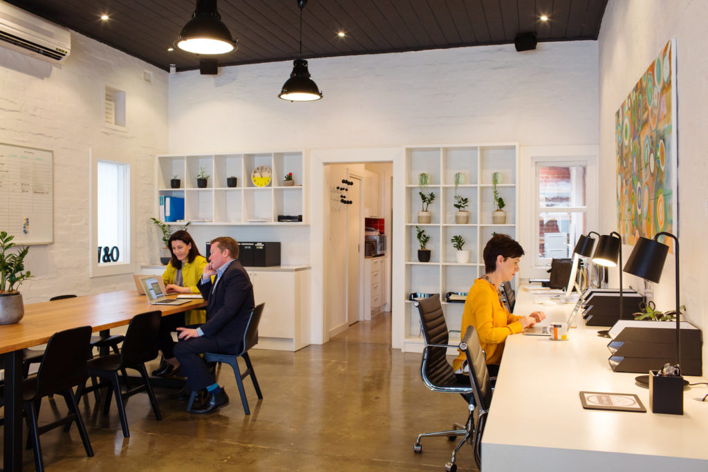
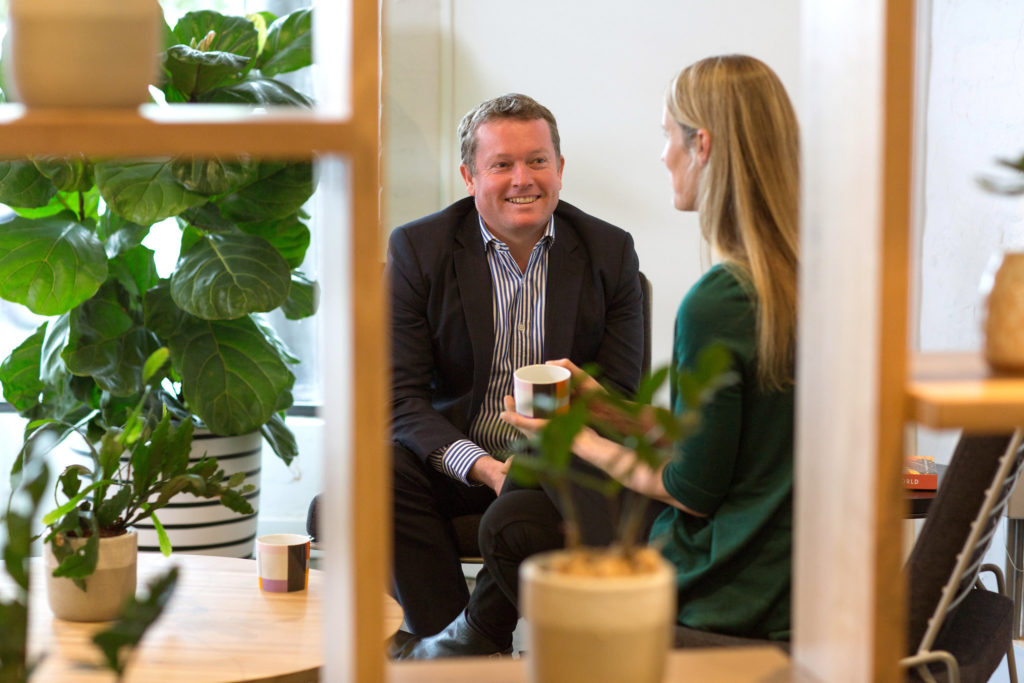
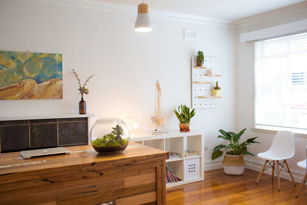
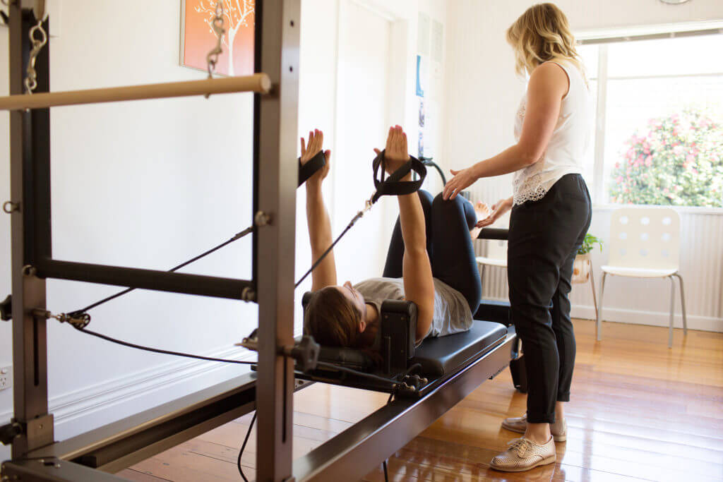
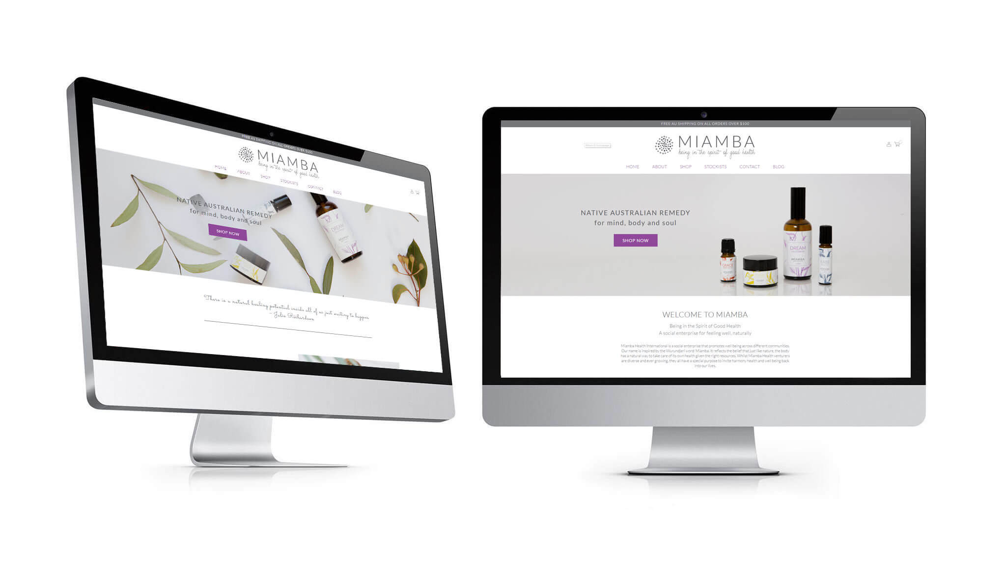
Here are some beautiful image Fi has taken for our clients for both the authentic story telling visuals as well as personal branding images.
Step 7 – Test Publish Update
Test
Before you go live have a few key people review the site for the following:
- Navigation clarity
- Links click to where they should go
- Language and spelling proofed
- Contact forms tested
- Check viewing on tables and phones, both IOS and Android
- Check viewing on Chrome vs Safari vs Explorer
- Load your Site map onto Webmaster Console
- Link to Google Analytics
- Set up security so your investment isn’t lost via hacking
Hit Go Live
The time to publish can be nerve-wracking but if you’ve put the site through the test with a few people you can feel comfortable all is ready.
Share the website as much as you can get traffic to it.
Update
There are several reasons to keep updating your site. We will cover off 3 of these now.
- Update plugins if you use WordPress to avoid hacking
- Update regularly and frequently with content (blogs) to keep your site fresh. This type of update tells search engines like Google your site is fresh and current. If you use your SEO keyword research to write blogs that are of interest to your target audience you are also more likely to get more suitable visitors to your site for your services.
- Update price lists, product and contact information as you evolve and your business grows to keep you site relevant.
Summary
Even though website design trends may change, just like clothing or car trends, you are now armed with the above 7 steps of how to design the best website for your small business.
There are some do’s and don’ts and in principle the key message is to think about your target audience and keep it simple and elegant with clear copy.
Reach out to our Bayside Website Designer Johannah for a free consult on how to Design the best website for your small business.
If you are wondering why people aren’t staying on your website you might like to read this article too CLICK HERE

Johannah Barton
Johannah is founder and owner of Confetti Design, a leading Melbourne Shopify Agency. Her extensive background in fashion, interior design, sales and marketing contributes to the Agencies great ability and reputation. She creates content that helps small businesses navigate the online space helping them to consider their website as a sales tool.
Read more
