I hope you enjoy reading this blog post.
If you want to discuss your website, we're here to help! Talk to Johannah.

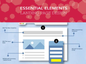
What are the best button colours for your sales pages?
We all know that colors play a large role in our marketing efforts, but have you ever taken a closer look at how color may be affecting your bottom line?
Believe it or not, color has a powerful influence on our emotions and decision making abilities, not to mention our first impressions of everything from a logo to a landing page.
Have you considered what are the best button colours and headline text for conversion?
Here are some key color areas to think about when designing your landing pages and calls to action:
Your brand
It is vital that you consider your branding when selecting colours for CTA buttons and text. The page needs to be appealing and easy to read.
Colours
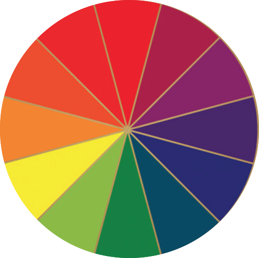
Colours on the colour wheel can be grouped and analysed by emotion, divided into passive vs active colours. Active colors are the brighter colours, from vibrant green round to bright red. They tend to excite both the mind and body and can be sources of energy and creativity. These are generally used as CTA buttons.
Passive colors are the more neutral and muted colors and tend to increase mental focus and have a calming effect. These include dark green round to deep plum and red. You will find text more often used in these colours.
Background colour
When using a solid color on your landing page background, make sure it won’t interfere with the text. And if it’s a deep color, make sure the text contrasts well. Mostly use a rule of squinting and see if the main headline jumps out. Easiest choice is to keep to whitespace to draw your viewer’s eye to your CTA. Design a clean landing page intended to create a flow towards your CTA.
Call-to-action colors
In choosing your colors for calls to action, consider what each color represents to you, your brand and how consumers will perceive them.
Try using this tool to select colours– Paletton Tool
Or this one is also great for guiding you in finding colour palates – Adobe Colour Tool
You may need Hex colour or RGB colours for these tools or for using Canva so this is great one: HEX to RGB & CMYK Tool
As a rule use contrasting colours on the colour wheel to those in your brand so it stands out. You may be limited a bit by your branding colours therefore if your brand is without a contrast colour, as they are all of a similar colour hue, then plot one of those colours in the tool and see what comes as a contrast to pick for your CTA buttons. Always keep in mind your brand, your customer’s tastes and good sense!
This article is quite useful in the argument around colour choice and ‘red as a CTA button is always more effective’ Which Color Converts The Best, by Conversion XL.
At the end of the day the success will be measured with testing and trying it out on your market with your copy and product. Good luck. x

Johannah Barton
Johannah is founder and owner of Confetti Design, a leading Melbourne Shopify Agency. Her extensive background in fashion, interior design, sales and marketing contributes to the Agencies great ability and reputation. She creates content that helps small businesses navigate the online space helping them to consider their website as a sales tool.
Read more