I hope you enjoy reading this blog post.
If you want to discuss your website, we're here to help! Talk to Johannah.
HOW TO DESIGN A LANDING PAGE THAT CONVERTS
In the past year I have designed a couple of landing pages and while doing so I collated a list of do’s and don’ts.
What is a landing page you may ask? A landing page is the page that visitors see after clicking on your Facebook ad, promotional email or if you provided a link in a traditional marketing piece. It can be a specific page on your website or a separate page created exclusively for search engines. A landing page is designed to direct visitors to take a specific action, such as making a purchase, completing a registration, or subscribing to your mailing list.
When I design a website I spend a lot of time considering the client, their personality, their brand and equally their customer. Every design element must meet these 2 criteria. The desired result is for the pages to connect with the visitor so they will feel trust and thus pick the phone or act.
When it comes to designing a landing page or sales page we have to also consider the key elements to convert a visitor into am more targeted action, the action of signing up and paying on the spot.
The 2 of these goals may sound the same but when it comes to design, copy and photography they are subtly different. This is no better time to employ a copywriter with landing page expertise.
Lets take a look at key elements of how to design a landing page that converts:
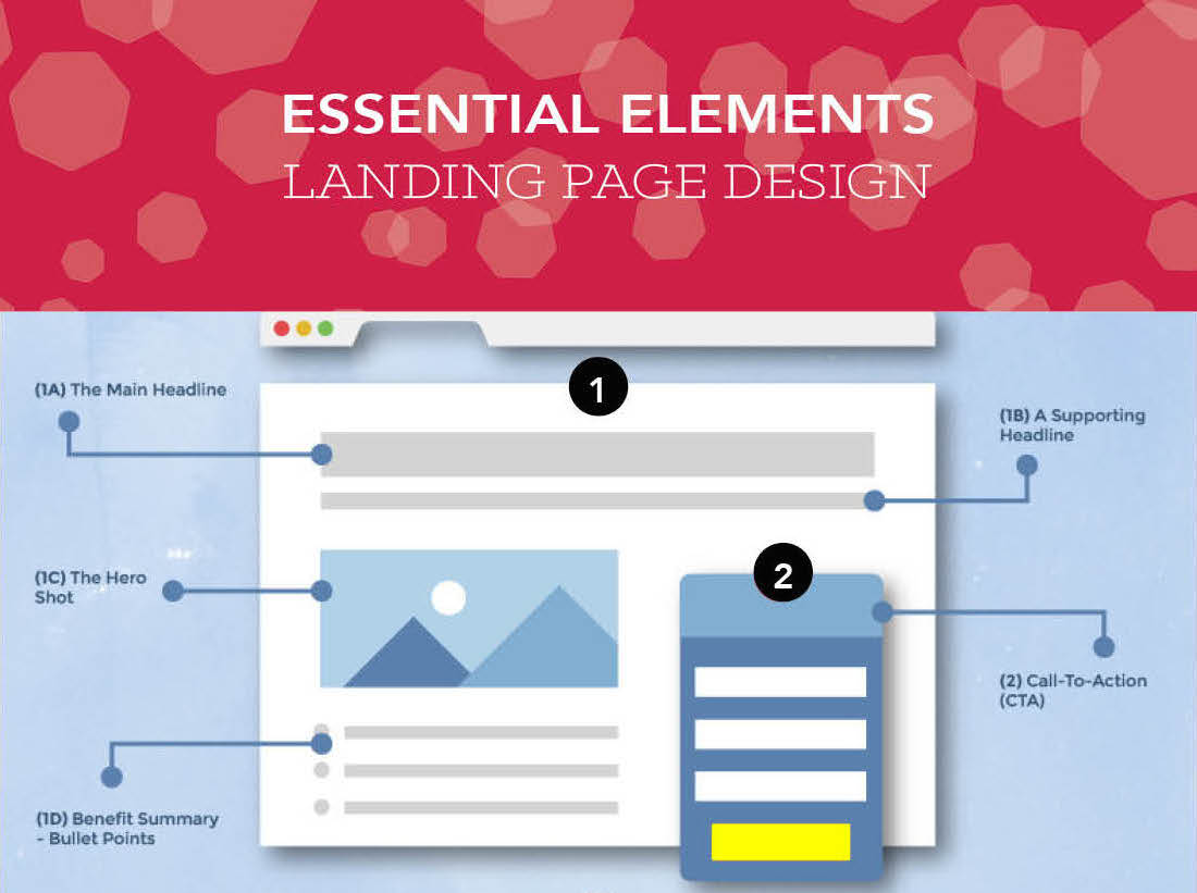
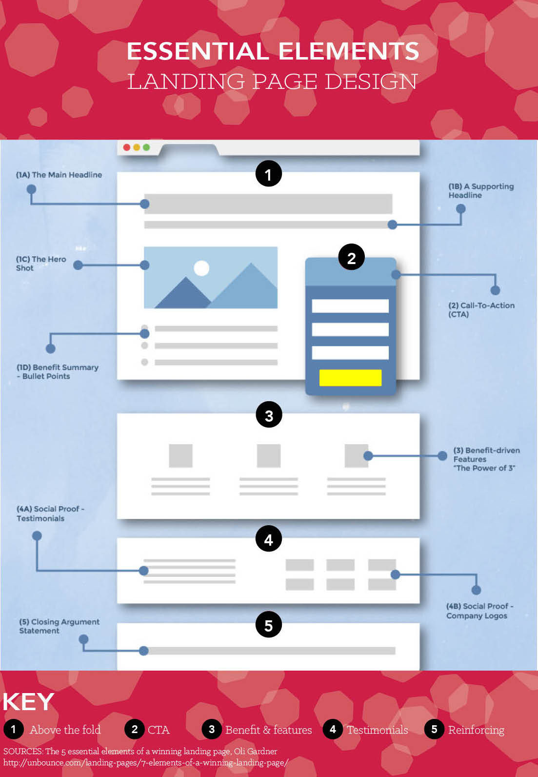
Headline
For a high converting landing page, the headline must be very visible, the first thing your visitor sees and it must offer a benefit. Keep your headline succinct, straight to the point and create urgency to the visitor acts then and there.
Ensure it is the same headline you use in the ads or links that get your customer to this page. They acted on a certain headline best not to confuse them into thinking they have been directed to an incorrect page by being tricky with your headlines.
Supporting sub-headline
A sub-headline will give people a reason to read your entire copy, instead of skimming or scanning it. Keep repeating this sub-headline to reinforce the benefit and to give context to the attention grabbing main headline. Use simply language.
One focal point
The brain processes visual information quicker than text. Just as an artist or interior designer always has one feature you notice more so should your landing page. Always add a visual focus to your landing page, such as your headshot, the product or a short video of benefits.
One call to action
The purpose of a landing page it to entice a visitor to take ONE specific action.
The action needs to be highly visible as a button to subscribe, download, purchase, share or a form to complete. More options you offer of actions the less you will see convert. The language needs to be simple and clear. The colour you choose as the button may need to be tested. HERE is another blog about the use of colour to help.
Remove distractions
A landing or sales page there is no navigation, no clutter, menu’s, links or extra buttons. The purpose is for the visitor to see the benefits, identify as someone who needs the solution you offer and then act on that message. You don’t want them navigation away or delaying with confusing messaging.
In particular these are other things you should keep off your page:
a. links to other parts of your sites such as “about” or “contact”
b. any pictures or images that don’t relate to the offer; these will only serve as distractions
c. small sized font, must be at least 14 px
d. any links along the lines of “click here to subscribe” or “click here to read more.” If you can’t cram all your content into the upper fold of your landing page, just let the user scroll down. Scrolling is almost always better than clicking to the next page.
e. scary forms with unnecessary fields such as “title” or “fax”
f. “clear fields” button
There are always exceptions and you usually can’t copy best practices to use on your site, but this advice given here should be your starting point. Get the essentials in place first, and tweak from there.
Customer/client testimonials or social proof
Add in testimonials to prove what you are offering. Testimonials can also overcome barriers to purchase. See my blog HERE for more on that.
Maintain your brand
Keep your landing pages looking as similar to your website as possible. Your brand is still communicating all the principles of you and connecting in the same way we are simply guiding them to act more definitively on a sales page. Keep the same colors, font – the overall look and feel of your main site. This helps to enforce the brand awareness.
Length
Long or short? Answer these questions: How much money are you asking for or how complex is the decision making process? How much emotion is involved? Or what level of anxiety is involved? The rule of thumb is the more you ask for the longer the page. The greater investment emotionally or time or financially the more you will need to include.
Testing
You will need to always test what colours, copy and images you have used. There is no magic wand as your customer will respond to your offering differently to others. Here are a couple of guides to help you understand A/B testing:
1. The Ultimate Guide To A/B Testing
2. What is A/B Testing?
We have identified the 9 key principles in designing your landing page now finally ensure you don’t break these 2 rules before you go live:
# 1. Never send traffic to your home page
To get people to your sales page you will need to market it on social media or traditional print or email marketing. The purpose of the sales page is create the urgency and get the customer to act, therefore you never drive traffic onto your website’s home page. Your homepage has a navigation where the visitor will go wandering and can easily exit before finding your offer.
#2: Make it relevant to YOUR customer
We have just seconds before a visitor makes a decision about whether our offer is useful or relevant. They will click away if they can’t find what they want or if it doesn’t entice easily without effort on their part. Confusion or miss-targeting will result in abandonment and no sales or sign ups.
Rather than let that happen, make the few seconds you have their attention count and answer the questions that are on their mind:
Does this place have what I am looking for?
Do they understand me?
Is there enough information?
Can I trust this person / business or product?
How long & much will this all take?
Your landing page must entice visitors to stay and complete the desired action for conversion, whether it’s filling out a subscription form or buying a product. Before you send your request off to your designer to get working on your landing page get the copy right. Sit down and create it on a blank page with a pen and map it out and answer these 2 questions.
This will save you lots of time.
1: Who is my target audience?
Make sure the landing page talks to a specific audience. Know the problem, the need and want your target audience has. You want to write the words with a particular person in mind.
If aren’t too sure about this then you my Clarity Process is a must. Read about the effectiveness here in identifying your competitive advantage and defining who your target customer is.
2: What do I want them to do?
Define the desire action. This is the one action people should take when landing on the page. What is the sole outcome you want for this page? Opt-in to build your list, purchase a product, attend a webinar?
3: What is my message?
You know your audience, the problem they have and the solution you can offer, write a simple and an easily understood message. This message will need to be tested but you have to start somewhere but above all else be straight forward, keep the tricky language out!
Once you have these you can either send it to a designer, like me! Or do it yourself by following the 7 key principles above. Good luck and don’t forget to test and measure!
Below is an info graph to give you a visual representation of how the principles in action.

Johannah Barton
Johannah is founder and owner of Confetti Design, a leading Melbourne Shopify Agency. Her extensive background in fashion, interior design, sales and marketing contributes to the Agencies great ability and reputation. She creates content that helps small businesses navigate the online space helping them to consider their website as a sales tool.
Read more