I hope you enjoy reading this blog post.
If you want to discuss your website, we're here to help! Talk to Johannah.
The Ultimate eCommerce Store Design Guide | Part 2: Shopify Responsive Design
The importance of Shopify responsive design for your online store! When researching how to build your Shopify or WooCommerce online store, you would have heard of the term ‘responsive design’. But what does it mean, and why is it so important for Shopify websites?
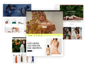
Part 1: the right theme
Part 2: responsive design
Part 3: essential design elements
Part 4: conversion elements
This article will answer those questions specific to Shopify and responsive design. It’s the second installment in our 4-part series: The Ultimate eCommerce Store Design Guide for 2023.
You can read the first installment, How To Pick The Right Theme For Your eCommerce Store here.
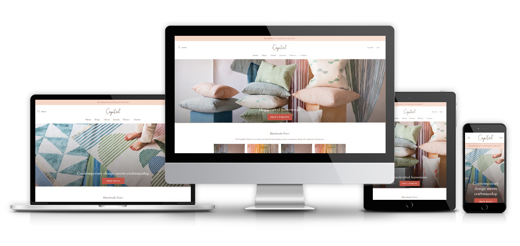
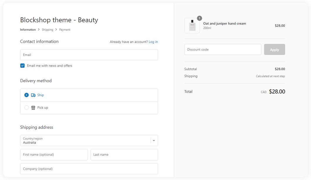
What is a Shopify responsive design?
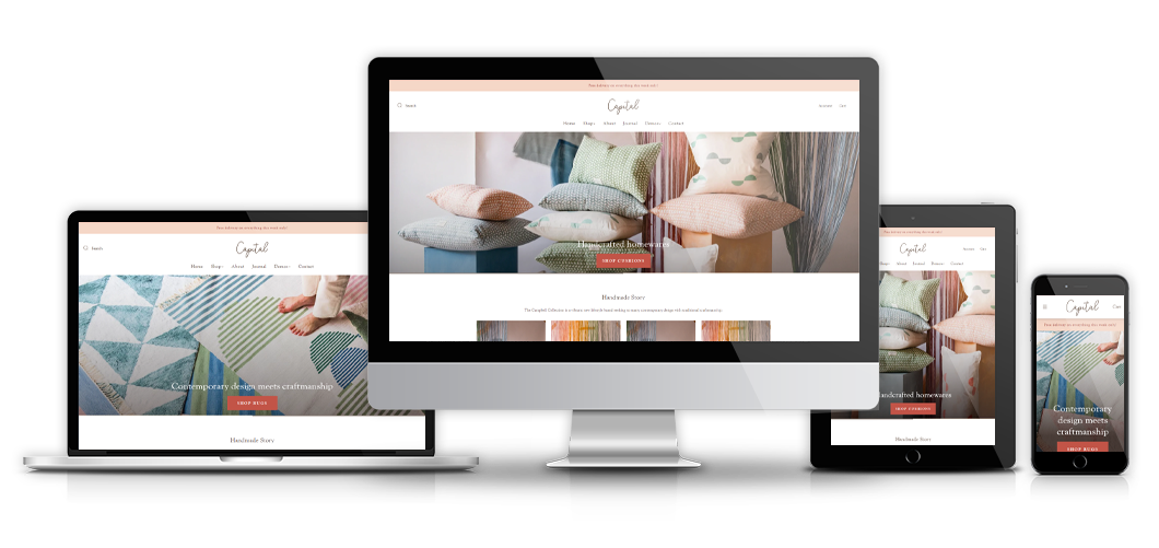
Think about all the different devices or screens you use to access the internet in a single day. You might use your desktop at work. A laptop at home. Your smartphone on-the-go. Perhaps you even have a tablet that you like to use.
All of these screens are different sizes. That means that whatever website you’re looking at needs to fit that website design in order to display correctly, this is responsive website design. The website design responds to the size of the screen.
Having your Shopify website with responsive design means that your website is designed in a way that it adjusts to different devices automatically. As a result, it looks the way it should, on any device. Users and customers don’t have to scroll to see your content, text is not squished crammed or difficult to read.
Why is Shopify responsive design so important?
If your potential customers have to squint, scroll, or they have any other difficulty in viewing your Shopify store, they will quickly click away – and they probably won’t come back!
We know that responsive website design is ultra important, in fact, 61% of users have been found to leave a website when they don’t find what they are looking for in their first attempt. As many as 48% of people think that a business without a responsive site is irresponsible towards the needs of their customers. That’s some PR nobody wants to receive!
Responsive website design also –
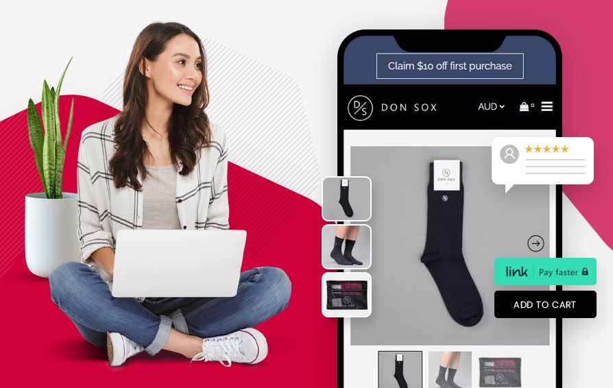
Gives customers a better user experience on your Shopify website.
A survey has even found that 57% of users make a purchase when they have a positive experience using a website. When your Shopify website is optimised to meet their needs and provide a hassle-free mobile experience, the better chances you have that they will make a purchase and come back for more.
Increases accessibility with responsive design
People purchase from websites using their phone, their laptop, even their smartwatch. The more your Shopify website offers responsive design, that is the website is easily accessible across all these platforms and screen sizes, the greater the chances you have of your visitors turning into customers.
In the hyper competitive eCommerce space, even a 1% jump in your sales can equate to a decent revenue boost to your bottom line. Every customer counts!
Helps boost SEO rankings with responsive design
Search engine optimisation (SEO) is the practice of getting your website found on the search engines like Google.
Google’s algorithm measures over 200 factors relating to your Shopify stores relevance to the search term. This includes how your users act when they visit your website. When a website visitor spends a good amount of time looking through your website pages, it indicates to Google that the visitor has found your website useful. Google rewards this type of website engagement by increasing the ranking – for that term or keyword.
Visitors to your website ‘bounce’ from your store quickly, indicates to Google that they didn’t find this suggestion of your website useful. That will negatively impact your ranking in Google.
Given that over 90% of all internet searches are done using Google, it’s a very good idea to stay on their good side!
Summing up Shopify Responsive Design
To build a responsive website design for your eCommerce store, Confetti Design has got you covered. Based in the Bayside suburb of Brighton in Melbourne, Confetti Design’s expert team of website designers and website developers know how to make your website look great on any viewing channel. Whether it be phone, tablet, laptop or desktop, our responsive website design is proven. Just ask over 500 website customers.
Give them a call today to discuss how to make your store responsive and more customer-and-Google friendly today!
Ready to Set Up Your Shopify Ecommerce Website?
Have you got an existing online store that needs to be taken to a whole new level? Are you looking to build your first Shopify ecommerce website, but don’t know where to start?
You’re in the right place. As Shopify experts in Melbourne, we’re passionate about helping business owners with their ecommerce websites. Confetti Design will work with you to prioritise your goals while being sensitive to your budget.
Our team has extensive Shopify design, development and marketing experience and can walk you through any customisation options. Give us a call or complete an estimate request to talk with our Shopify expert developers.
We can help!

Johannah Barton
Johannah is founder and owner of Confetti Design, a leading Melbourne Shopify Agency. Her extensive background in fashion, interior design, sales and marketing contributes to the Agencies great ability and reputation. She creates content that helps small businesses navigate the online space helping them to consider their website as a sales tool.
Read more